brandon

yip

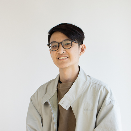
Image of Brandon Yip
Hello! My name is Brandon, and I am a graphic designer with a heavy interest in traditional and digital illustration. I am always looking for opportunities to bring these practices into design all the time. I enjoy approaching design on simpler terms, using as much as I need to accomplish my goals. However, that doesn’t mean I am not open to branching off to more complex or diverse approaches to design! Aside from illustration, my hobbies include video games, my cat Cleo, and interests in fashion.  

Before the Yellows and the Blues

Before the Yellows and the Blues begins a six-part series of my experiences at the pinnacle of the American education system. This first part shows the different thoughts and feelings I, and other sources had on my high school. I graduated from a very prestigious high school and entering design school deflected from the status quo. Developing this book came with many challenges. At first, I wanted to create one book for my entire college life with the inclusion of my time exiting high school. Eventually, this became a larger task than expected and the idea had to be split into six parts. Before the Yellows and the Blues showcases the time where I felt the most uncertain academically with an interesting variety of design formats while being held together with a regimented typography and iconographic design system. In the future, the series will continue to expand with more editions for each step in my college experience being developed with similar and different design principles.
Discomfort

Creating a book for an artist with an already established name and legacy can be difficult. There were many ideas that I wanted to encapsulate in this catalog after seeing Freud's work for the first time. What I wanted to emulate was an uncomfortable, confined, feeling for the reader to experience, like how Freud’s work evokes these feelings when looked at for the first time. With an extremely rigid and confined design system, each page requires the reader to navigate through tight columns placed right against heavy blocks of text. Images being placed very close to type creates an almost claustrophobic feeling. The book is meant to be picked up and its orientation will change in order for the reader to see some images in their intended view. The entire experience of reading this book is to evoke the discomfort that is felt in Freud's work.

Less-Waste Instant Ramen

Packaging today can be extremely wasteful with the prevalence of single-use plastics. Looking for eco-friendly solutions in an industry that has very little diversity in packaging with a heavy emphasis on original brand loyalty was difficult. Regardless, a recyclable paper box and no plastic wrapping noodles reduces the amount of potential waste after this product is consumed. Having noodles with no plastic packaging was inspired by the designer Holly Grounds and their work creating noodles wrapped in a biofilm that dissolved in boiling water. Formulating the idea for this design came with years of consuming ramen and other single-use plastic products. As the topic of environmental sustainability becomes more prevalent, I wanted to create packaging for a potential product that could potentially help reduce unnecessary waste, as well as potentially influence others to become more aware of the topic at large.

Kendall Wolson

Hope Zucco